Digital Signage Font Guide | Chapter 1: Font Forms

When designing content for display on a digital sign, typography is often overlooked. As inconsequential as it may seem, your choice of font says a lot about how you want your audience to perceive your brand, and it can make a huge difference on how legible your content is from certain distances. Our three-part Digital Signage Font Guide will look at best practices for selecting the font type, the font color and font pairings for your digital signage content. Chapter 1 starts by exploring best practices for choosing the right font type for your content.
Serif or Sans-Serif Font?
Two of the most important font styles to know are serif and sans-serif fonts. On some font styles, like Georgia, you may notice small decorative barbs attached to the ends of the letters. A typeface with any decorative flourishes at the end of the letter is called a “serif”. Its counterpart is called sans-serif and does not contain any decorative flair.
Sans-serif fonts are best used for short snippets of text. That way, your text looks simpler and cleaner and doesn't detract from the message. So the audience can view the text easily, consider sans-serif fonts.
Examples of popular sans serif fonts:
- Roboto (default Android font)
- Arial (default Google Docs font)
- Calibri (default Microsoft Word font since 2007)
You’ll note that they all look very similar. Plain and unobtrusive, they get the job done without any fanfare getting in the way.
On the other hand, serif fonts are better used for large blocks of text such as a novel or a newspaper, or other similar “walls of text” on a page. Of course, what works on a printed page may not apply to content seen on a digital display. Sans-serif fonts are typically best used for digital content.
The serif font does have some uses in digital signage. A title that conveys significant importance could use a fancier font, and you may stray from the austerity of sans-serif fonts at such an occasion. Of course, if your company or institutional logo contains a serif font, there is no reason to worry that the font is too bold or decorative.
Examples of popular serif fonts:
- Georgia (commonly used in books)
- Garamond (good spacing and clear edges for displays)
- Times New Roman (default Microsoft Word font before 2007)

Font Size
When determining font size, the legibility of your content is imperative. Very seldom does it make sense to have a large block of text on digital signage, as this requires a closer viewing distance and longer attention span.
It’s important to note that legibility is not the same thing as visibility. Visibility is how easy it is to see that there is an image on a sign, but legibility is your actual ability to read the content on a display. Legibility depends on three major factors:
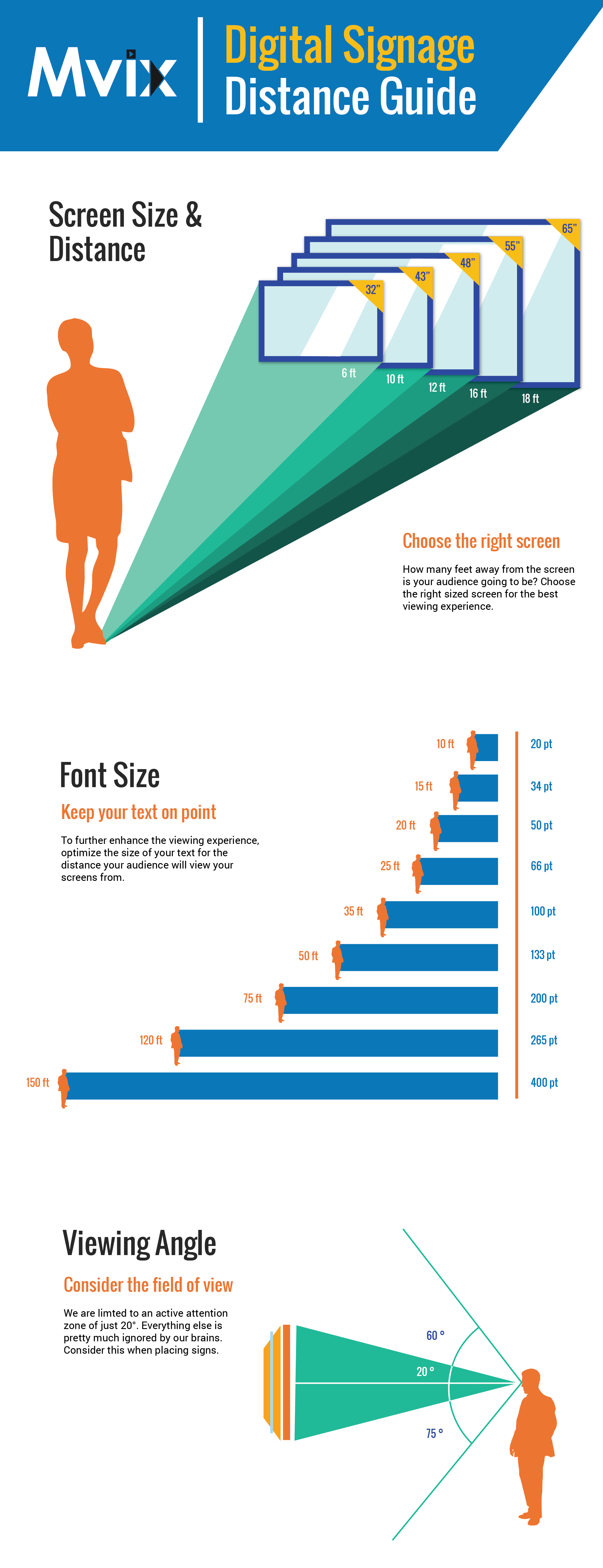
- Viewing distance: Will your display be seen from afar or will your audience interact with the screen directly? Your text needs to be larger to compensate for greater distances. This Distance Guide can be a useful resource in determining font size for a display.
- Time of engagement: How long does it take to read your content? People generally spend just a few seconds reading displays, so your content should be bite-sized and to the point.
- Audience: Who is reading your content? A display targeted toward children will have very different content requirements than a display for the elderly.
Changing any one of these factors will have an effect on others.
Almost always, less text is better. If the message requires a large amount of information to be complete, it’s often a much better idea to address the audience briefly, then direct to an online source for additional information. This can be especially important when attention spans are minimal.
One other consideration for font size is the line spacing. In most word processors, the default spacing is close to 1 (perhaps 1.1 or 1.2 in modern programs). However, that is often not enough for proper viewing of digital signage content. Make sure that you’re not cramming more information onto the display than can be easily viewed. Our Digital Signage Font Guide recommends 1.5 spacing to allow for text to read evenly over a display.
Font Styling
There’s an old saying that goes “if everything is important, then nothing is.” This saying can be aptly applied to font styling options. Observe the following example: If you use bold, italics, underline, or different colors constantly, then how can the audience understand what is actually important, and what you’re emphasizing for no good reason at all?
If you choose to use any of these styling options, use them sparingly. The only words that should be bolded are those of critical importance. Avoid mixing and matching styles as well.
Content Hierarchy
It is important to consider content hierarchy in your digital signage content. This is a method of emphasizing portions of the content to create a natural flow when viewing it. Keep your audience properly engaged with titles, subheadings, quotes, and even images.
Adjusting a font’s size and style is one such option. Use bigger fonts or stylized text in places to draw the audience to those locations, keeping their interest from start to the finish.
One example would be having the title in an underlined serif font
Then a bolded sans-serif font for the subtitles
And a normal Sans-Serif Font for the actual content in each block.
Ideally, you want to stick to two or three different font types within the digital signage content. Consistency is key, and the more changes there are, the more cluttered and distracting it will be.
*****
In chapter 2 of our Digital Signage Font Guide, we bring color into the conversation. We look at what colors are analogous, what emotions they convey and best practices for incorporating color into digital signage content.
For more creative typefaces, try out Fonts.com or Google Fonts for inspiration.


