

Solutions for Audience Engagement
Real-Time Team Communication
Showcase data & reports from popular integrations like Power BI, MS Teams, Tableau, Klipfolio & Google.

Tap Into Immersive Engagement
Designed for environments like schools, government agencies, and corporate offices, they streamline access to critical information.
These solutions support dynamic content such as directories, event schedules, and self-service tools.

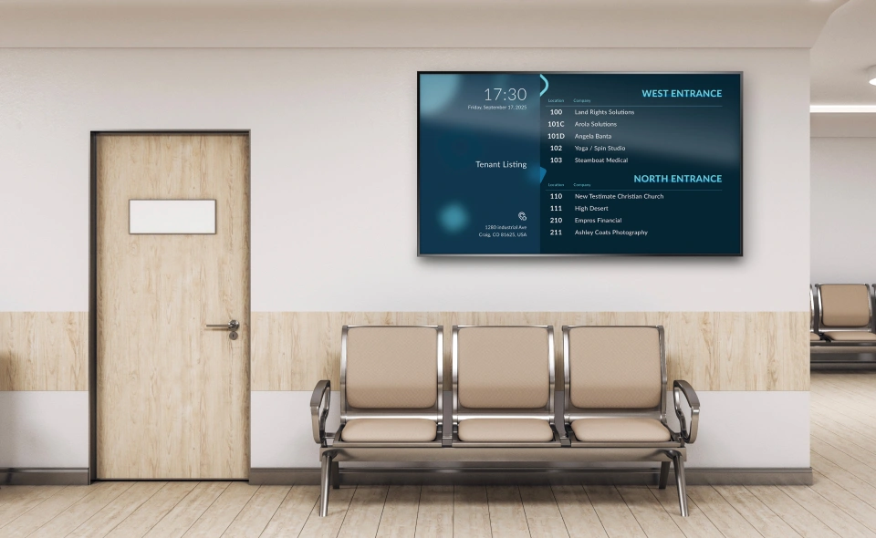
Efficient Wayfinding For Visitors
These solutions enhance navigation and visitor experience while reducing the need for costly updates.

Visibility That Drives Performance
From tracking production output, safety metrics, or inventory levels, you'll be able to keep your teams aligned and informed.
.webp)
Fresh Content With Instant Updates
Through integrations such as Square or Toast, we bridge visual appeal with operational efficiency to deliver a scalable menu solution.

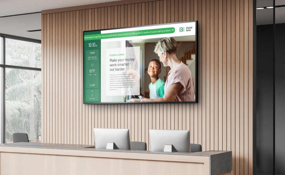
Create A Memorable First Impression
Deliver company news, event schedules, or building directory information to keep your visitors informed and engaged.

Optimize Courthouse Efficiency
With instant updates & remote management, these solutions eliminate confusion, reduce errors, and enhance transparency for visitors & guests.

Keeping Travelers Informed
%20V1.webp)
Enterprise-Ready Digital Signage
Centralized Cloud Management Platform
Scalable to Support your Brand Growth
Backed by Trusted Security Frameworks
Integrated with Popular Data Sources

Simplify the Signage Experience
The #1 Digital Signage Content Management System

Benefit From No-Subscription Digital Signage

Remotely Manage Multiple Displays

Keep Your Audience Safe & Informed

Scalable Access & Storage Without Limits

Professional Designs at Your Fingertips

Future-Ready Media Players
Discover the All-In-One Solution

Digital Signage Without Monthly Costs
Lets talk about your Project

How It Works
Then, login to our secure Digital Signage CMS via a web-browser.
Lastly, upload or design your content and schedule playback.
Amplify Your Brand Strategy


Partners
By partnering with trusted technology providers, we strive to deliver ongoing value and drive innovation for our clients.
Digital Signage FAQs
How Does Digital Signage Work?
The entire ecosystem can be split into the content, software, and hardware segments. First you have the content that will go on the screen. This can be pictures, videos, or a variety of other content applications.
These files and content apps are handled through the cloud software. The hardware is your digital signage player and/or screens that will then display the content on your screens at the .
Why Mvix?
Mvix offers a unique approach to digital signage implementations at an aggressively competitive price-point. As a full-service provider, we offer both software and hardware, along with enterprise-class implementation services to fit your project needs.
As our hardware also comes with our software bundled for free, that means you don’t need a monthly subscription to keep your content going. The award-winning software also works with a variety of options such 3rd party players, BrightSign, Sony, AndroidOS, Raspberry Pi and more!
Mvix also provides content creation, signature care, installation, and managed services to encompass and end-to-end implementation.
What content do I need?
The content you need really depends on the solution you have. For restaurants, a simple image display for the menu with a social media feed is a solid choice. For offices and manufacturing, you might want to focus on current/upcoming company events with data visualization charts.
Schools however can utilize almost every content app as solutions can be used in the classroom, hallway, lobbies, and cafeterias.
How much does digital signage cost?
Depending on the solution you choose, you can expect to spend anywhere from a small monthly fee to hundreds of dollars a month. Some providers also offer a hardware/software bundle that can help keep costs down.
Mvix offers two separate pricing options:
- Lifetime, perpetual license of hardware and/or software starting at $350. No ongoing fees; OR
- Monthly subscription fee starting at $25/month for use of digital signage software with 3rd party hardware
There are also other costs to consider such as content management, the screens you need, and quality support.
What type of screen do I use?
The two types of screen types you have are LED & LCD and the displays are split between commercial and consumer. While commercial displays usually have a higher upfront cost, the long term benefits outweigh the price. The commercial displays have a higher brightness, portrait/landscape options, longer warranties, and can operate for longer hours.
Can I get a free trial?
Of course! Mvix offers free software trial accounts to clients curious about the Mvix CMS Software. Contact a solutions consultant today to learn more about our free trial option.


