A Helpful Guide to Installing ADA Compliant Signage
Editor’s Note: We have updated this post to include an infographic for easy reference of ADA Compliant signage.
Just like static signs, digital signs have to comply with the Americans with Disabilities Act (ADA).
The ADA prohibits discrimination against individuals with disabilities in all areas of public life. Indeed, this includes employment, education, transportation, and any place open to the general public, many of which have digital signage.
What happens if a sign can’t be read by a person with visual impairment? Similarly, what if a touchscreen is out of reach for someone in a wheelchair? What are the requirements for ADA-compliant signage?
Specifically, these issues can impact any organization’s visitor experience, communication effort, legal risk, and even revenue streams.
Why the ADA Matters
Above all, the purpose of the ADA is to enable persons with disabilities to have equal rights and opportunities, just like everyone else.
Imagine if a visually impaired person was trying to read a train schedule on a digital sign with minuscule letters and numbers. How would this person know when and where to catch their train if the schedule was unreadable to them?
The CDC estimates that in the U.S. there are 12 million people 40 years and over with vision impairment. In fact, 61 million adults live with some form of disability.
In short, for these people, signage that fails to take their needs into account amounts to discrimination.

While some may object to this reality, there’s another way to look at it. If you run a business or organization, do you want to exclude a large group of people from understanding the signs you have in place?
In fact, non-compliance with ADA guidance regarding signage can cost up to $75,000 in fines.
The robustness of the digital signage industry points towards a wide range of benefits. However, you dilute your investment if your signs are hard to interpret.
Furthermore, it can be very expensive to redesign or replace signage if you are hit with a lawsuit.
The convergence of reasons to make all signage, including digital signage, ADA-compliant cannot be ignored. In fact, legal, communication, and business advantages encourage all organizations to pay attention.
Who must comply with the ADA?
According to the DOJ as reported in the Bureau of Internet Accessibility, “no individual shall be discriminated against based on disabilities in the full and equal enjoyment of the goods, services, facilities, privileges, advantages, or accommodations of any place of public accommodation.”
Title II prohibits discrimination in the activities and facilities of state and local governments.
Title III prohibits discrimination based on disability in places of public accommodation.
The key here is what’s considered “public accommodation?” From a legal perspective, it’s just about anything involved in people accessing a public space. In other words, any space that is not owned by someone.
To clarify, eCommerce websites (where there are no brick-and-mortar outlets) are included in the ADA. While thousands of lawsuits have focused on website accessibility, it should be noted that the legal emphasis revolves around the overall spirit of ADA Title III.
According to the renowned law firm, Seyfarth & Shaw, 2019 was a record-breaking year for Federal ADA Title III lawsuits. The cases ranged anywhere from Braille gift card complaints to website and mobile app accessibility cases.
However, the majority of lawsuits came from physical public accommodations, such as hotels, retail stores, restaurants, and shopping centers.

It might be easier to state who doesn’t need to comply with ADA standards since nearly every facility is expected to have signage that meets guidelines. For instance, prisons and sites eligible for the National Register of Historic Places may be exempt.
Signage Required
Otherwise, all places open to the general public must have ADA-compliant signage, including:
- All state, county, and local government facilities
- Public accommodations and commercial facilities, including:
- All stores and shops
- Restaurants, bars, and theatres
- Sales or retail establishments
- Service establishments
- Places of lodging and recreation facilities
- Private museums
- Places of education
- Office buildings
- Factories, warehouses, and manufacturing plants
- Public areas of apartment and condo buildings
- Private residences with a commercial area
What are the ADA Requirements?
The 2010 ADA Standards for Accessible Design is a 275-page document that sets minimum requirements – both scoping and technical – for newly designed and constructed or altered facilities to be readily accessible to and usable by individuals with disabilities.
Chapters 2 and 7 of the document contain highly detailed guidelines on ADA-compliant signage.
We have summarized the most important here:

1. No glare
Your ADA-compliant signs must have backgrounds and characters that avoid any glare. There is one exception: parking or traffic signage.
This is because visually impaired people can have trouble processing glare or reflection.
2. High contrast
Lettering and background should have a high level of dark-to-light contrast. According to ADAAG Title III-4.30, a 70% contrast is required. The reason for this is again, visually impaired customers can struggle if contrasts are too low.
3. Clear, easy-to-read typefaces
It sounds simple and obvious, but it can easily slip through the net. Making sure there are enough spaces between letters and that the font is clear is paramount.
Select from fonts where the width of the uppercase letter “O” is 55% minimum and 110% maximum of the height of the uppercase letter “I”.
Some fonts to use for ADA compliant signage:
- helvetica
- futura
- eras
- optima
- avantgarde
- trebuchet
- verdana
- vag rounded
- franklin gothic
- frutiger
4. The use of braille
To assist the sight-impaired, braille is required for signs that identify permanent locations. In addition to braille, raised characters should also be used to ensure that the sign can be read by touch. This is what defines a tactile sign.
Make your braille dots rounded, not flat or square. Also, you should also separate them a minimum of 3/8 inch from raised text and other raised objects.
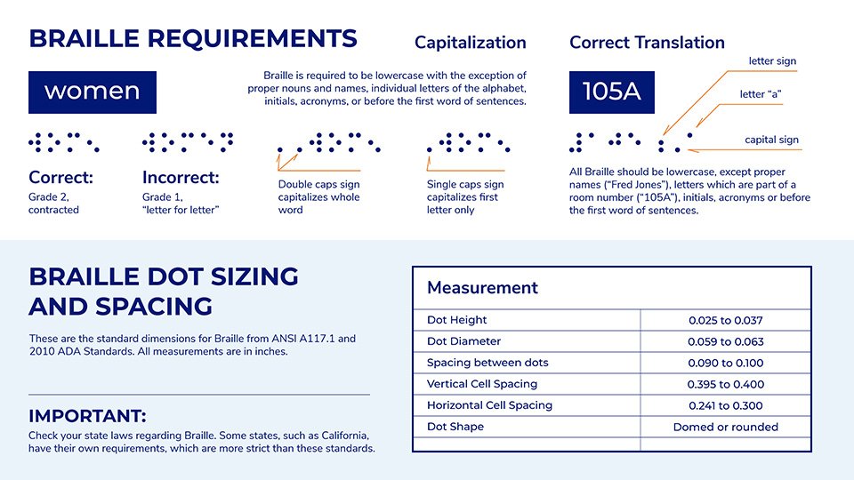
You can use braille translation software to make sure that what you want to say is spot on.
The characters in tactile signs must be:
- raised a minimum of 1/32 inch from their background
- uppercase, sans serif, and without italics, script, or oblique
- have a height of between 5/8 inch and 2 inches, based on the height of the uppercase letter “I”.
- for a viewing distance of less than 72-inches, the minimal character height is 5/8-inch
- positioned directly below the corresponding text
Use pictograms on tactile signs. A few things to note about them:
- place the pictogram in a 6-inch “field” area
- place the text and braille dots directly below
- they should contrast with their background and have no glare
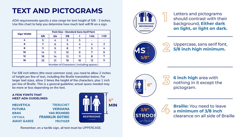
Note that the above requirements are for signs used to identify permanent rooms and spaces.
Accordingly, overhead and projection-mounted signs do not require braille or raised characters, and they can have uppercase and lowercase characters with a minimum height of 2 inches.
5. ADA mounting location
Placement and location are important for ADA-compliant signage.
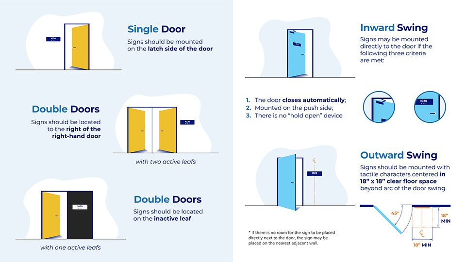
- Single Doors – the sign should be mounted on the latch side of the door.
- Double Doors – with two active leaves, the sign should be to the right of the right-hand door.
- Double Doors With one Active Leaf – the sign should be on the inactive leaf.
In addition to the number of doors, there are requirements specific to the swing of the door.
Those with an inward swing where the door closes automatically and there is no “hold open” device should have the sign mounted directly on the door. In other words, the sign should be on the push side.
If the swing of the door is outward, the tactile sign should be centered in 18″ x 18″ clear floor space and it should be beyond the arc of the door swing.
6. Mounting height for ADA signs
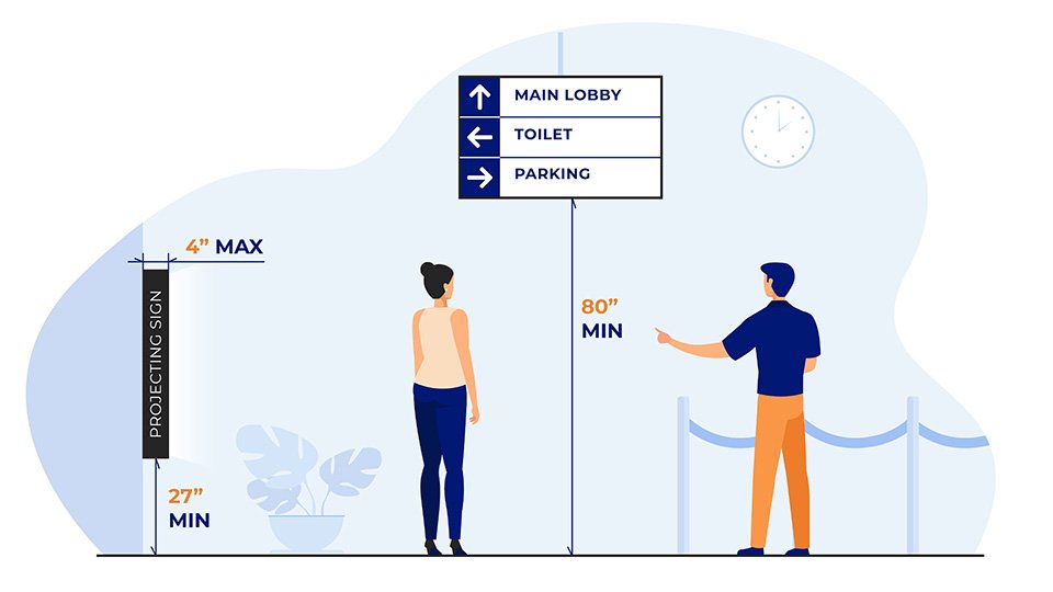
The ADA mounting height requirement is 48” to 60” for raised characters i.e. the distance between the floor and the bottom of the raised character should be 60″ (from the highest character) to 48″ (from the lowest character).
Specifically, the bottom of overhead signs must be 80″ from the floor.
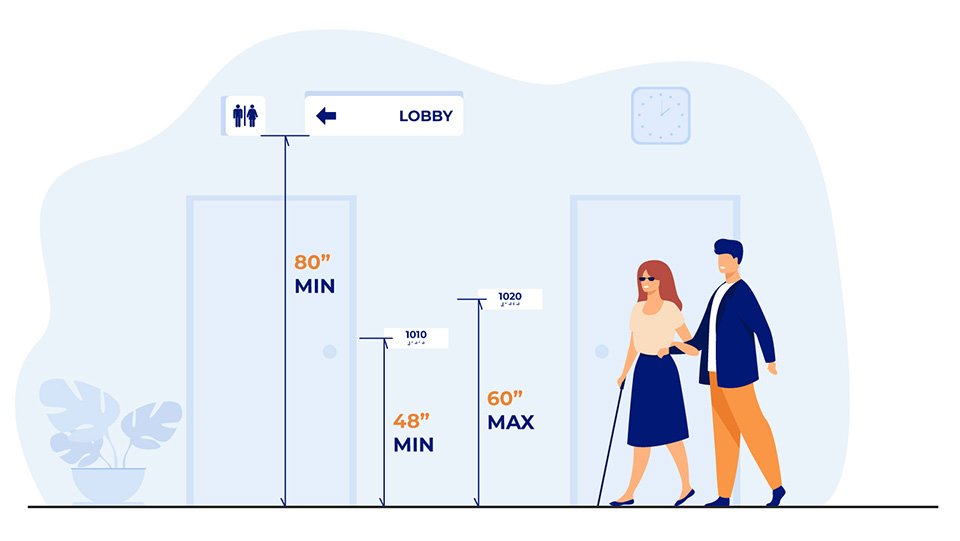
For wall-mounted or projecting signs, they should extend 4″ from the wall and must be installed at least 27 inches off the ground with a maximum height of 80 inches.
Touchscreen kiosks also have to comply with ADA guidelines. Design your kiosk based on front-reach versus side-reach for best results.
Both will need a ground clearance of 30 inches by 48 inches, and the max height is 48 inches off the ground.
For front-reach kiosks with obstructed access to reaching interactive controls (e.g. the touch screen), the screen can be set back to a max of 20 inches when the max height of the kiosk is 48 inches.
Set the controls back 10 inches to allow side reach access.
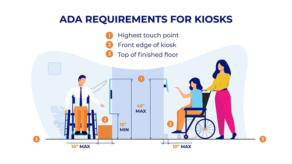
When you design kiosks, be sure they slope upwards for easy wheelchair accessibility. A 15° to 20° slope allows for the content to be within reach of most users.
Are digital signs better than static for compliance?
One of the advantages of digital over static signs is customization. Accordingly, you are better positioned should there be changes to the ADA in the future.
For example, the current ADA Standards do not specifically mention color blindness.
Color blindness (color vision deficiency, or CVD) affects approximately 1 in 12 men (8%) and 1 in 200 women worldwide. Interestingly, most people with color blindness have the red/green variant. This means that even if your lettering and background have an acceptable light-to-dark contrast, the color of each can affect readability.
To clarify, digital signs are ideal for adapting to these kinds of variables that may come up in future ADA regulations. In the same way, it makes sense to configure your signage to be as clear and understandable as possible for everyone.
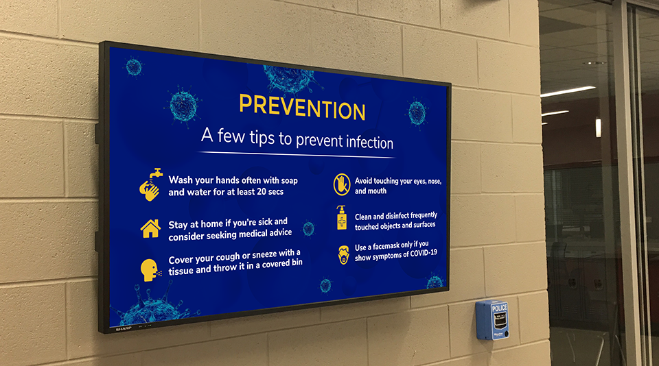
Consequently, organizations that fully grasp the potential of a truly integrated digital experience will gain a competitive advantage, remain compliant with regulators and satisfy more users including those living with a disability.
