Do Your Digital Signage Screens Pass The Squint Test?
Have you ever been to a restaurant and wanted to place an order but couldn’t because you couldn’t read the menu options? Did squinting help with making out the details on the menu? Or, have you felt frustrated enough that you want to leave a building because you couldn’t make out the details on a wayfinding sign?
No one wants to or should have to squint to read your digital signage screens. If your target audience is squinting to read what is on display, then your screens have indeed failed the digital signage squint test.
Interestingly, digital signage solutions have a 47.7% effectiveness on brand awareness. These signs also capture more views than static signs and have an astoundingly high recall rate. However, viewers will only recall a message and recognize a brand if they actually read it. This is why it is important to ensure your signs are legible.
Read on to learn more about the medical background of squinting, the squint test in digital solutions, and how best to improve your signs so they pass the test.
The Squint Test in Digital Signage
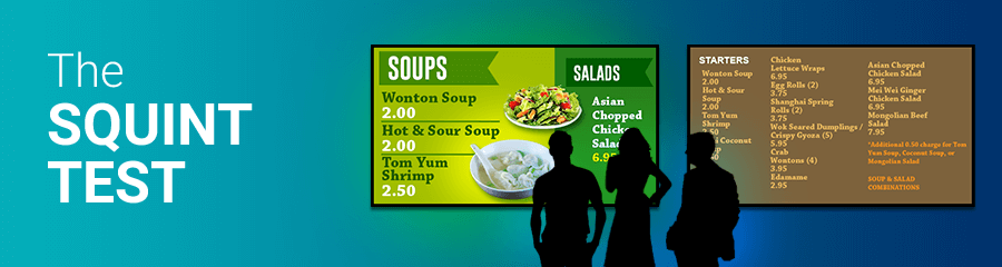
In the context of digital signage, the squint test is a tool that helps design experts determine whether the primary elements of the signage have focus. It tests whether or not the sign is legible from a distance.
Design experts use it to determine if the primary elements of the page have focus. A highly optimized sign will have some key elements that will naturally catch and draw the audience’s attention. The squint test measures how effectively your signage draws attention.
Performing the Squint Test
To conduct the test, squint your eyes and let them freely navigate your digital signage screen. Where do your eyes first navigate to on the screen? These are the high-traffic areas making up the high-traffic sections of your sign. Indeed, these sections should be at the top of the visual hierarchy of your screen.
Therefore, optimizing this section and ensuring it has proper flow will improve the effectiveness of your screen in passing across your message. Include crucial highlights of your message, with particular attention to valuable content. In fact, case studies have shown that these high-traffic sections are the best for placing call-to-actions messages.
Taking Action: Top Best Practices
With the squint test as part of your digital signage design process, you have the opportunity to correct any readability issues identified before publishing. Remember to do the test as many times as you may wish until you get the legibility of your copy just right.
Here is a look at a few suggestions to improve the readability of your screens and ensure they pass the squint test.
1. Increase the Font Size
The viewing distance should inform the font you pick for the text on your signs. The further away the viewer is from the screen, the bigger your font should be. For this reason, it makes sense to have a bigger font on restaurant menu boards that patrons will be viewing from about 30 feet away than a welcome board in your lobby which is about 5-10 feet away from visitors.
You may want to use a smaller font to fit more text. Think again! Less is more with digital signage, and not just because of the squint test. Actually, digital signs have an average attention time of 0.7 seconds, which is why your message must be concise. Viewers should never feel burdened to go through lines of text on your digital screens. So, ensure you use fewer words and leave enough white space around the text.
2. Choose Sans-Serif Fonts
Sans-Serif fonts are easy to read from a distance and at a glance compared to serif fonts. For instance, if you want your primary message to stand out, use a boldface sans-serif font for maximum visibility. Also, Open Sans and Arial are some great font picks for your digital signage.
According to a poll, 48% of customers complained about the novelty font used on retail signage being “too fancy,” affecting legibility.
3. No More Than Two Fonts
Using different fonts in your design is great for creating contrast. However, you should be careful not to overdo it, as mixing too many fonts will make the display appear too busy, and the viewer will have a hard time reading the message. So, stick to a maximum of two fonts, one for the headings and the other for the details.
4. Go Easy on the Italics
Any text that is italicized is harder to read at a glance, forcing your viewers to squint. Therefore, it’s best to avoid italics altogether for a good design, but if you must, italicize just a word or two.
5. Contrast with Background
You want your message to stand out, and increasing its contrast against the background elements is a great way to achieve this. Therefore, choose a font color that is in high contrast with the background. While at it, be sure to avoid overly vivid colors, as these can make the text difficult to read even when the viewer isn’t too far away.
When choosing background and foreground colors, use opposing colors like light on dark and vice versa. This can save your audience from squinting to read your signage display. It also allows you to pass the squint test! Saturation and color options are critical when designing your digital signage screen. Additionally, consider the power of color psychology as your color choices can influence viewer mood and behavior.
6. Too Much Movement
Generally, having too many animated features on a screen can overwhelm a viewer. This mostly comes from a person’s naturally being drawn to movement. You shouldn’t have more than one major animated content (small animations like weather are fine to include) and this should be the main focus on your display.
7. Not Enough Time
When designing content for your display that cycles through a playlist, the transition speed is key to not souring your audience’s impression. Go too fast, they get frustrated. Too slow, and they get bored. Try to test viewing your content live to see if you need to increase or decrease the time spent on certain parts of your playlist.
Design, Measure, Learn, Then Redesign
Perform the squint test and go back to the design to adjust what needs to change. Whether you need to change the font size, font color, or the contrast with the background, redesigning your screens as many times as it may take is well worth the effort. As a result, commit to making the necessary changes after performing this simple test, and you can perfect your digital signage.
A great design that is legible from a distance is well worth the investment and will have the most significant impact as it will attract the attention of ensuring the targeted message reaches the viewer.
Get Professional Help
Need help with optimizing your signage strategy? Digital signage experts have the knowledge and skills to make your designs pass the squint test and, therefore, more effective. Professional custom digital signage content design will incorporate the best practices, tips, and tricks to increase the legibility of your signs while ensuring brand consistency.

